// LAYOUTS & PRINTS
// BRAND CONSISTENCY & DEVELOPMENT @Managemen Events
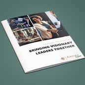
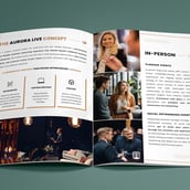
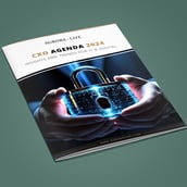
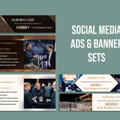
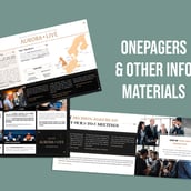
Aurora Live was launched as a premium sub-brand of Management Events – from logo and website to banners, I helped shape its initial visual identity: clean, modern, and exclusive.
Over time, the design evolved – from logo to fonts, colors, and key visuals – adapting across both print and digital platforms like LinkedIn, Facebook, and Instagram.
This evolution also led to the Aurora Live Podcast, where the logo highlights its core: high-value dialogue with top-tier speakers.
This is where I come in:
• Working hands-on on design assets
• Developing new design approaches for our projects
and publications
• Quality control of assets created by the team
• Managing Deadlines for various projects at a time
• Ensuring seamless colaboration with the Marketing Team
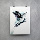
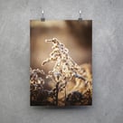
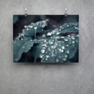
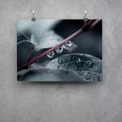
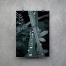
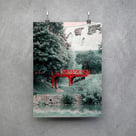
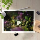
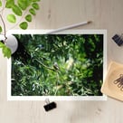
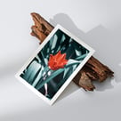
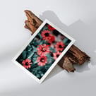
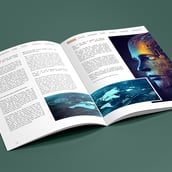
Print is not dead – and I know my way around it.
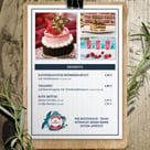
From abstract digital art to photography, I create print-ready layouts in various sizes for my own store. I enjoy exploring different angles of print design, because even if the format feels a bit old-school, it still delivers a unique sense of quality you can literally feel.
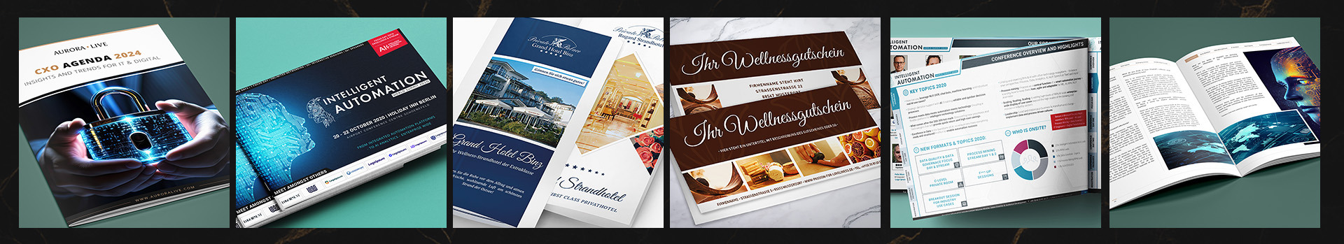
// PRINTS @ckDesigns
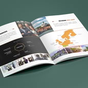
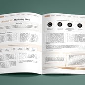
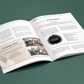
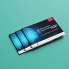
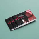
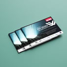
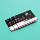
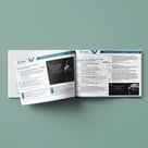
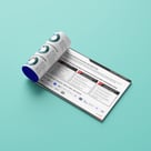
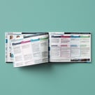
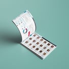
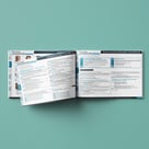
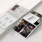
At IQPC Germany, each industry conference needed its own flexible, on-brand brochure. Agendas and speakers changed often – so layouts had to keep up, fast and stress-free.
Since the Brochures for each event had to be flexible, user friendly and easy to correct last minute, I introduced different Templates for use, standardizing layout and cover while maintaining the freedom to make things look unique in brand.
Conference branding was key – evolving year by year while staying recognizable and practical.
// SUB-BRAND VARIETY @IQPC
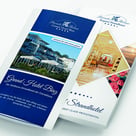
They are everywhere.
From digital to Print - I know what I am in for. My favourite tactics? THE GRID. Always works. ;)